Your Architecture Diagrams Are Already Dead (You Just Haven’t Buried Them Yet)
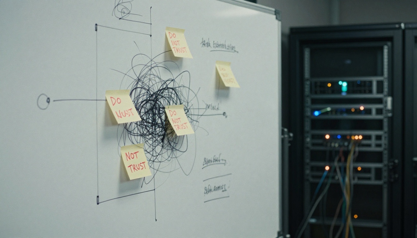
Your architecture diagram looked perfect six months ago. Clean boxes, well-labeled arrows, a legend that actually made sense. Today? It’s a archaeological artifact that has about as much relationship to your production system as a cave painting has to a Tesla. The code evolved. The diagram didn’t. And now your team is making critical decisions based on a fiction.
This isn’t a failure of discipline. It’s a failure of paradigm.
The Architecture Drift Reality Check
A recent Reddit discussion on architecture documentation struck a nerve, racking up dozens of comments from engineers who’ve lived this exact nightmare. The pattern is depressingly consistent: a team creates a system diagram, the code evolves faster than anyone can update the visuals, and eventually those diagrams become “suggestions” rather than sources of truth. Senior engineers hoard the real architecture in their heads, while everyone else works from outdated artifacts they don’t trust.
One commenter crystallized the problem: “If the code evolves faster than the diagrams, then they are not Architectural diagrams but Technical Documentation.” The distinction matters. Architectural documentation should capture what doesn’t change frequently, the structural pillars, the trust boundaries, the core interactions. But most teams are drowning in technical documentation that becomes obsolete the moment a pull request merges.
The real kicker? Most organizations have already quietly surrendered. The phrase “the code is the documentation” has become a coping mechanism, not a strategy. Teams update diagrams only for onboarding or audits, treating documentation as a ceremonial exercise rather than a living engineering artifact. The result is predictable: knowledge silos, onboarding nightmares, and architecture decisions made on gut feelings instead of ground truth.
When Systems Fail by Assumption
Here’s where it gets expensive. As explored in a recent DEV Community article, modern systems don’t fail loudly, they fail by assumption. Architecture drift isn’t just an inconvenience, it’s a direct path to production incidents that don’t have clean root causes. When your diagrams don’t match reality, you’re not just missing a visual aid. You’re missing the early warning system that tells you when your assumptions have expired.
Consider the typical microservices setup. A diagram shows Service A calling Service B over HTTPS. What it doesn’t show, because it was drawn six months ago, is that Service B now has a circuit breaker that fails open after three timeouts. Or that the database connection pool was resized during an incident and never documented. Or that a developer added a caching layer that introduces subtle consistency issues.
These aren’t bugs in the traditional sense. They’re assumption violations. The architecture evolved while the story you tell about it stayed frozen. By the time you notice, you’re not debugging a single failure, you’re debugging a system that quietly redefined itself underneath you.
The cost manifests in ways that don’t show up in incident reports:
– Security reviews that can’t be cleanly approved because nobody knows the actual trust boundaries
– Cost increases disconnected from usage because the deployment topology is a mystery
– Reliability issues without single root causes because the failure modes were never visualized
The “Docs-as-Code” Delusion (And Why It’s Only Half Right)
The proposed solution from tooling vendors is seductive: treat diagrams like code. Store them in version control. Auto-generate them from your infrastructure. Render them in CI. Atlassian’s documentation pushes this heavily, suggesting architecture diagrams should be “reviewed and iterated” like any other artifact. Lucidchart promotes auto-generation from cloud environments, promising to “construct, maintain, and even auto-generate cloud architectures quickly and easily.”
But here’s the uncomfortable truth: most auto-generated diagrams are technical noise, not architectural signal.
A diagram spun up from your AWS console will faithfully reproduce every VPC, subnet, and security group. It will also be completely useless for answering the questions that actually matter: Should we split this monolith? Where do we put caching? Can we meet our availability targets? The machine sees infrastructure, humans need architecture.
The problem isn’t the generation, it’s the abstraction level. Auto-generated diagrams show you what exists, not what matters. They document the forest but can’t tell you which trees are load-bearing.
This is where the automated architecture documentation and its pitfalls become painfully apparent. The tools are getting better at rendering, but not at understanding. They can’t distinguish between a critical dependency and a transient resource. They don’t know which interactions are synchronous versus async, which data flows are encrypted, or which components are single points of failure.
The Five Diagrams That Actually Matter
After years of watching teams drown in useless documentation, I’ve found a pragmatic approach that works. It’s not about having one diagram, it’s about having the right diagram for the decision at hand. The C4 model gets this right by forcing different abstraction levels, but even that can be simplified for teams that need to ship, not philosophize.
1. The Conceptual Boundary Diagram
This is the “city limits” view. Draw one box labeled “Our System.” Place external actors (users, IdP, payment provider) outside it. Connect them with arrows that describe what happens, not how. This diagram should change maybe once a quarter, if it’s changing weekly, you’re drawing implementation details.
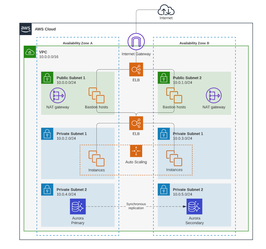
2. The Container Diagram
Now you can get specific about runnable units. Show your web app, API service, workers, databases, caches, and message streams. Label edges with protocols and key semantics. This is where you answer “what runs where” and “what talks to what.” The goal isn’t completeness, it’s clarity on the primary request paths and async follow-ups.
3. The Component Diagram (Surgical Strike Only)
Don’t draw this unless you absolutely must. Open up one container, usually the API service, and show its internal modules and data ownership. This is your tool for splitting monoliths or resolving team coordination issues. If you’re drawing component diagrams for every service, you’re documenting code, not architecture.
4. The Deployment Diagram
When reliability or cost is on the table, map your failure domains. Show regions, clusters, network boundaries, and scaling knobs. This is where you make latency assumptions explicit: cross-region calls add 30-120ms, cold starts add 50-500ms. It’s not about precision, it’s about flagging where reality can diverge from expectations.
5. The Sequence/Request-Flow Diagram
This is the debugging superweapon. Pick one user action, “place order”, “sign in”, “generate report”, and draw the exact sequence, including timeouts, retries, and async follow-ups. A good sequence diagram reveals retry storms, missing caches, and external provider dependencies before they become incidents.
The Culture Problem Tools Can’t Solve
Here’s where the Reddit discussion gets uncomfortably honest. One commenter nailed it: “This is ultimately more about culture than systems. If you cannot get your team to care about and value good documentation, then it will fall by the way side. Fundamentally, most people are lazy.”
Ouch. But accurate.
You can have the best docs-as-code tooling in the world, Mermaid, PlantUML, Structurizr, the Python diagrams library, and still end up with stale diagrams if updating them feels like overhead with no payoff. The technical lead quoted in the Reddit thread admitted: “You’ll have to actively engage in people engineering/wrangling. Far easier said than done. And honestly there is no magic bullet.”
The hard truth is that architecture documentation decays because organizations don’t assign ownership of assumptions. We have code owners, service owners, even on-call rotations. But who owns the question: “Is this diagram still true?” Crickets.
This is why validating system design without senior architects becomes such a critical skill. When the senior engineer who held the architecture in their head leaves, the team discovers their documentation was mostly tribal knowledge with Visio window dressing.
The AI-Assisted Documentation Trap
In 2026, the siren song of AI-generated diagrams is getting louder. Feed your codebase to an LLM, get a perfect architecture diagram out. What could go wrong?
Plenty. As explored in LLM-generated code causing architectural drift, the same risks apply to LLM-generated documentation. The AI will confidently draw arrows that look plausible but represent outdated or incorrect relationships. It will miss trust boundaries that aren’t explicit in code. It will generate diagrams that are technically accurate but architecturally meaningless.
I use AI assistants to propose skeletons, but I never accept them blindly. The workflow is:
1. Provide strict format constraints (“C4 container diagram with these specific components”)
2. Verify every edge against the codebase
3. Treat the output like a junior engineer’s first draft, helpful, not authoritative
The danger isn’t that AI generates bad diagrams. It’s that teams will trust them because they look professional, accelerating the drift between what’s drawn and what’s deployed.
What Actually Works: A Pragmatic Workflow
After watching teams succeed and fail at this for years, here’s what actually moves the needle:
Store Diagrams With the Code
Put diagram source files (*.mmd, *.puml, *.dsl) in docs/architecture/ next to the services they describe. Not in a separate wiki. Not in a shared drive. In the repo, where code changes and diagram changes can be reviewed together.
Make Updates a Merge Requirement
Add a lightweight rule: PRs that change architecture must update diagrams. Not every PR, just ones that modify dependencies, add services, or change trust boundaries. Enforce it with a checklist, not a gate. The goal is habit, not bureaucracy.
Render in CI
Use Mermaid’s CLI or PlantUML’s Docker image to render diagrams during builds. Publish them to a simple static site. This makes the current architecture visible without requiring engineers to install diagramming tools.
Validate Syntax
A simple Node.js script can validate Mermaid syntax in CI. Broken diagrams should break the build just like broken tests. Here’s the pattern:
// Minimal validation script
import fs from "node:fs";
import mermaid from "mermaid";

const diagramFiles = process.argv.slice(2);
let failed = false;

for (const file of diagramFiles) {
  const text = fs.readFileSync(file, "utf8");
  try {
    mermaid.parse(text);
    console.log(`✓ ${file}`);
  } catch (err) {
    console.error(`✗ ${file}: ${err.message}`);
    failed = true;
  }
}

process.exit(failed ? 1 : 0);
Review Diagrams in Design Reviews
Don’t just review code. Project the container diagram and ask: “Show me where this change fits.” If engineers can’t point to the box they’re modifying, they don’t understand the architecture well enough to change it safely.
The Event-Driven Documentation Crisis
If you think regular architecture documentation is hard, try documenting an event-driven system. As explored in documentation challenges in event-driven systems, the decoupled nature that makes these architectures powerful also makes them nearly impossible to visualize statically.
A container diagram shows Service A publishing to a Kafka topic and Service B consuming from it. What it doesn’t show is the implicit schema contract, the expected message rate, the backpressure behavior, or the dead-letter queue configuration. The diagram looks simple. The reality is a distributed state machine that nobody can fully trace.
This is where sequence diagrams become essential. You need to show not just the publish/consume relationship, but the full context: What triggers the event? What happens if it’s delayed? What’s the retry policy? Where does poisoned data go?
Without this level of detail, your event-driven architecture documentation is just a bunch of boxes and arrows telling a comforting but incomplete story.
The AI Agent Factor
Here’s the curveball that makes this entire discussion more urgent: AI agents designing systems without human oversight are already in production. These agents can spin up services, wire dependencies, and deploy infrastructure faster than any human architect can document it.
The architecture drift problem is about to accelerate from “concerning” to “existential.” When a human engineer modifies a service, there’s a chance they’ll update the diagram out of professional courtesy. When an AI agent does it, that chance is zero. The agent doesn’t know the diagram exists. It doesn’t understand architectural governance. It just sees a problem and applies a pattern.
This means the documentation gap is no longer just about human laziness or business priorities. It’s about the fundamental velocity mismatch between autonomous agents generating systems and human architects trying to comprehend them. The architectures of 2027 won’t just drift, they’ll sprint away from their documentation.
Stop Drawing, Start Versioning
The architecture documentation dilemma won’t be solved by better drawing tools. It won’t be solved by AI generation. It will be solved when we stop treating diagrams as artifacts and start treating them as executable specifications.
The breakthrough isn’t in the rendering, it’s in the storage. When your architecture diagrams live as versioned text in your repos, when they’re validated in CI, when they’re required for merge, they stop being optional documentation and start being part of the system itself.
This is the real promise of “diagrams as code.” Not that they look pretty, but that they stay true. A diagram that can’t be wrong is worth more than a hundred diagrams that might be right.
Your architecture diagrams are already dead. The question is whether you’ll bury them and move on, or prop them up in the corner and pretend they’re still guiding your decisions.
The teams that win aren’t the ones with the best diagrams. They’re the ones whose diagrams are always true, even if they’re incomplete. Because an honest, incomplete diagram is infinitely more valuable than a comprehensive lie.
Next Steps for Your Team:
- Pick one critical user journey and draw a sequence diagram in Mermaid
- Commit it to your repo and render it in CI
- Add a PR template checkbox: “If this changes architecture, did you update the diagram?”
- In your next design review, project the container diagram and make engineers point to their changes
- Set a calendar reminder: every quarter, spend 30 minutes verifying your top-level boundary diagram
The goal isn’t perfect documentation. It’s documentation that can’t lie to you.