Pretty Galaxies Won’t Fix Your Monolith: The Brutal Truth About Code Visualization Tools
We’ve all been there: staring at a 200,000-line codebase, trying to understand why a simple refactor in the authentication module just broke the billing system. In desperation, you reach for the latest shiny tool promising to turn your tangled mess into a “galaxy” of stars, each file a luminous node, dependencies mapped as elegant constellations across a dark void. It looks incredible in the demo. But three hours later, you’re still lost, and now you have a migraine from the WebGPU particle effects.
The proliferation of visualization tools like GitGalaxy, Codebase Memory MCP, and Understand Anything raises an uncomfortable question: Are we actually solving architectural opacity, or just building prettier ways to stare at our technical debt? The research suggests the answer depends entirely on whether you’re looking for cognitive shortcuts or cognitive offloading.
The Bioinformatics Gambit: When DNA Sequencing Meets Technical Debt
GitGalaxy takes an approach that sounds like science fiction: it treats your codebase as genetic material. By employing BLAST-like algorithms, the same tech used to scan DNA strings, it parses repositories at roughly 100,000 lines of code per second, achieving peak velocities of 513,298 LOC/s when scanning the Apollo-11 Guidance Computer assembly (141,445 lines processed in 0.28 seconds).
The tool generates what it calls “risk exposure metrics” rather than traditional code quality scores, measuring dimensions like “Cognitive Load Exposure” and “State Flux Exposure.” It outputs three distinct artifacts: a GPU-rendered “galaxy” visualization, low-token markdown summaries for AI agents, and full JSON audits for compliance teams.
The premise is seductive: if bioinformatics can map the human genome, surely it can map your microservices architecture. But here’s the friction, visualizing complexity isn’t the same as reducing it. GitGalaxy’s 3D star charts might reveal that your utils folder has spiraled into a black hole of cognitive load, but they won’t tell you whether to refactor it, split it, or burn it down and start over. Like visualizers that expose how little we understand about our AI models, these tools often highlight the depth of our ignorance without providing a ladder out of the pit.
Performance vs. Practicality: The 28 Million Line Stress Test
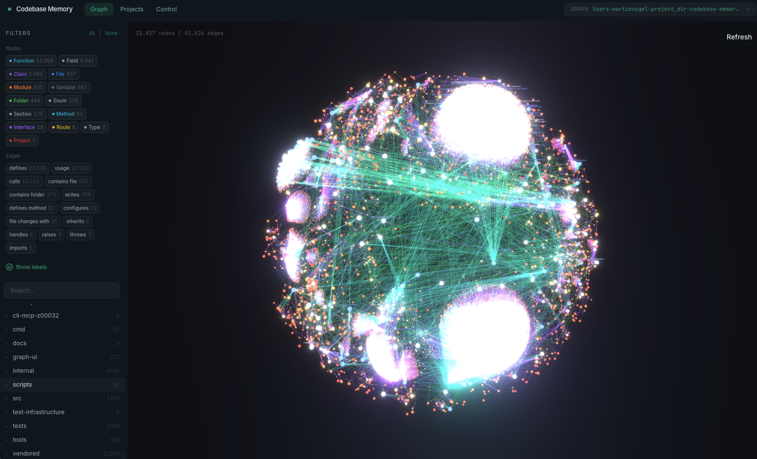
If GitGalaxy represents the artistic approach, Codebase Memory MCP is the engineering brute-force solution. Written in pure C with zero dependencies, it indexes the entire Linux kernel, 28 million lines across 75,000 files, in approximately 3 minutes, producing a persistent knowledge graph of functions, classes, and call chains.
The numbers are staggering: sub-millisecond query times, 99.2% token reduction compared to file-by-file grep exploration (3,400 tokens vs. 412,000), and support for 66 languages via vendored tree-sitter grammars. It exposes 14 MCP tools for architecture analysis, dead code detection, and cross-service HTTP linking.
Yet performance metrics can be misleading. Just because you can map a monolith in three minutes doesn’t mean you should keep it as a monolith. The tool’s built-in 3D graph visualization (available at localhost:9749 in the UI variant) renders your architecture as an explorable space, but there’s a risk of what engineers on forums have identified as “visual aesthetics distraction”, spending more time admiring the physics simulation than fixing the circular dependencies it reveals.
The Skeptic’s Dilemma: Do We Need Galaxies or Just Better Charts?
When GitGalaxy surfaced on Reddit, the reception was predictably polarized. Critics immediately questioned whether the “galaxy view” offered insights unavailable in simpler chart representations. The sentiment distilled to a core concern: fancy visual experiences don’t necessarily extract better insights than traditional dependency graphs, and they might actively steal attention from the actual data.
The developer’s response was telling, they acknowledged the critique while defending the multi-modal approach. GitGalaxy outputs three reports specifically to address this: the GPU visualization for executives who want to “see” the architecture, LLM-compatible markdown for AI-assisted analysis, and raw JSON for engineers who need actual data. This triangulation suggests the visualization is as much about communication as comprehension, turning technical debt into something you can print on a poster for the CTO’s office.
The Knowledge Graph Arms Race: From Static Analysis to Living Documentation
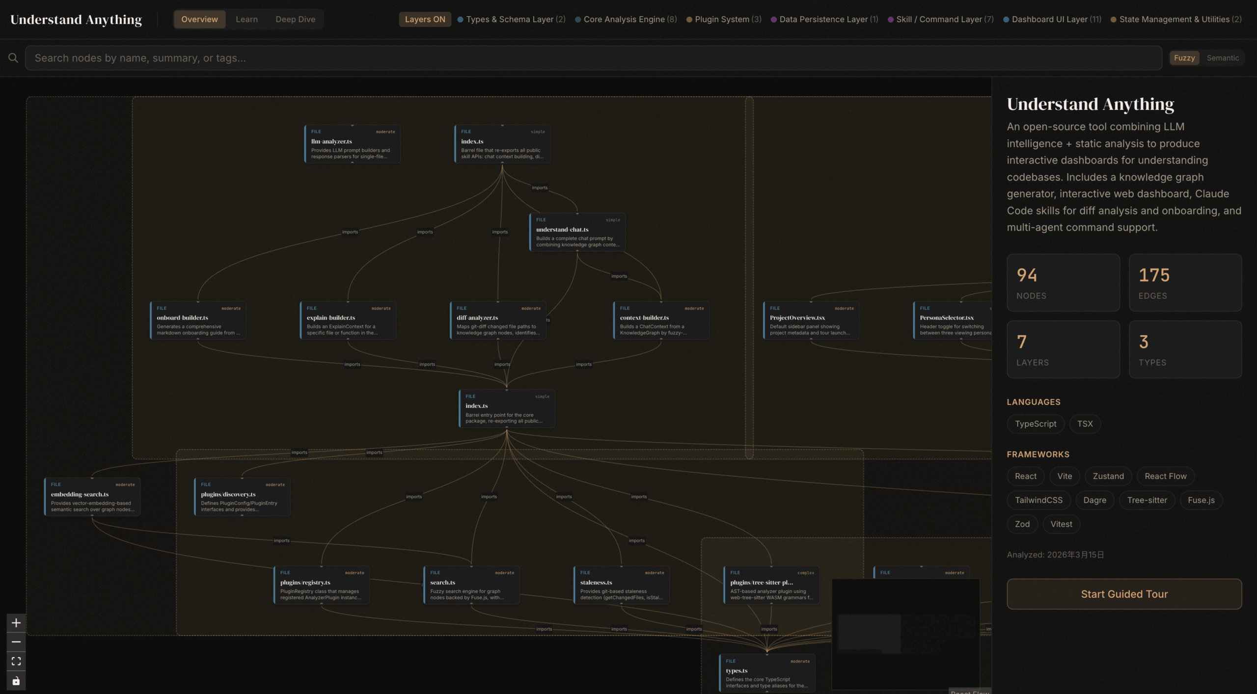
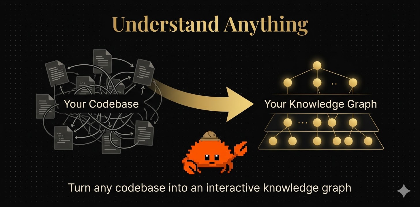
Understand Anything takes a different tack, leveraging a multi-agent pipeline (project-scanner, file-analyzer, architecture-analyzer, tour-builder, and graph-reviewer) to construct interactive knowledge graphs using React Flow. With 8,000 GitHub stars and climbing, it’s gained traction by targeting the onboarding crisis, helping new developers navigate unfamiliar codebases through “guided tours” and plain-English summaries.
The tool attempts to bridge the gap between static analysis and living documentation, generating C4 model diagrams, Architecture Decision Records (ADRs), and technical debt inventories automatically. It exposes business domain knowledge extraction, mapping domains to flows to steps in an interactive horizontal flow graph.
But this introduces a maintenance paradox: the visualization is only as current as the last scan. In rapidly evolving codebases, these graphs become archaeological records almost immediately. The “persona-adaptive UI” adjusts detail levels for junior devs versus architects, but if the underlying code is shifting daily, you’re essentially building a map of a city that’s being demolished and rebuilt in real-time.
IDE Integration: CodeGraphy and the Physics of Dependency
While standalone tools battle for attention, CodeGraphy takes a more pragmatic approach as a VS Code extension with 8,272 installs. It renders dependencies as physics-based graphs directly in your editor, offering 2D and 3D views, timeline playback for git history, and actions like rename and delete directly from the graph nodes.
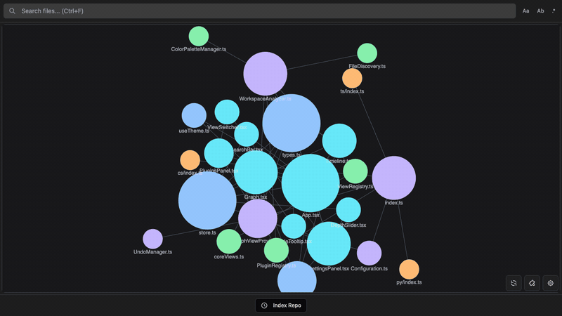
The physics simulation serves a functional purpose, files naturally cluster based on relationship density, making architectural boundaries visible through spatial grouping rather than explicit color-coding. The timeline playback feature allows you to “scrub” through commits and watch dependency graphs evolve, potentially revealing architectural drift before it becomes a crisis.
However, the modular plugin architecture (separate extensions for TypeScript, Python, C#, and GDScript) introduces fragmentation. You need the core extension plus language-specific plugins to get full dependency detection, creating a configuration overhead that simpler tools avoid.
Cognitive Load or Cognitive Crutch?
The central tension in evaluating these tools lies in distinguishing between cognitive load reduction and cognitive offloading. When Codebase Memory MCP reduces token consumption by 99%, it’s not just saving money, it’s compressing the context window so developers can hold the entire architectural state in working memory. This is genuine cognitive load reduction.
But when GitGalaxy renders your codebase as a crystalline galactic empire, it risks becoming a cognitive crutch, a substitute for understanding. The visualization becomes a black box itself, where developers trust the “risk exposure” metrics without understanding the underlying BLAST algorithm’s limitations or the taxonomic language feature map’s blind spots.
The uncomfortable reality is that these tools excel at revealing problems but struggle to prescribe solutions. They can tell you that your API layer has high “concurrency exposure” or that your state management has dangerous “flux”, but they can’t tell you whether to adopt CQRS, event sourcing, or a simple refactor. They’re diagnostic instruments, not treatment plans.
When Visualization Becomes Architecture
The most compelling use case for these tools isn’t day-to-day development, it’s architectural governance. When Codebase Memory MCP generates a call graph showing that a seemingly isolated utility function is actually invoked by 47 different services, it provides empirical evidence for refactoring decisions. When Understand Anything extracts business domains and maps them to code structures, it creates a shared language between product managers and engineers.
In this context, the “galaxy” view isn’t for the developer trying to fix a bug, it’s for the CTO arguing for a platform team, or the engineering manager justifying a six-month rewrite. The visualization becomes a political tool, translating technical complexity into visual rhetoric.
The risk, of course, is architectural theater, creating beautiful diagrams that mask rotting foundations. A 3D graph of a tightly-coupled monolith is still a picture of a tightly-coupled monolith. No amount of WebGPU particle effects can decouple your services for you.
The Verdict: Hype with Utility, But No Silver Bullet
Code visualization tools occupy a strange middle ground between indispensable and ornamental. GitGalaxy’s bioinformatics approach offers genuine novelty in pattern detection, particularly for security auditing (identifying “weaponized injection vectors” and “hardcoded payload artifacts”). Codebase Memory MCP’s performance benchmarks, indexing 28 million lines in 180 seconds, prove that scale is no longer an excuse for architectural opacity.
Yet the skepticism voiced by early adopters remains valid. These tools solve the problem of seeing complexity, not the problem of managing complexity. They turn the black box into a glass box, but if the contents are still spaghetti, transparency only makes the mess more visible.
For teams managing large-scale repositories, the utility is real but specific: use them for onboarding, for security audits, for refactoring planning, and for creating the visual artifacts necessary to secure buy-in for architectural investments. But don’t expect a galaxy view to tell you how to fix your monolith. That still requires human judgment, hard decisions, and the willingness to delete code rather than just admire its constellations.
The tools aren’t just hype, they’re sophisticated lenses. But lenses don’t fix broken eyes. They just help you see the damage more clearly.