The ‘Snazzy’ UI That Doomed Jurassic Park: A UX Autopsy
Let’s get the obvious out of the way: "It’s a Unix system, I know this!" is a meme that has achieved immortality. But behind the snark lies one of the most fascinating and under-analyzed depictions of enterprise system architecture in cinema history. Jurassic Park didn’t just have cool props, it had a real, functioning, deeply flawed system design that can teach us more about high-stakes UI/UX than a dozen modern case studies.
This isn’t just about nostalgia for chunky CRTs. It’s about how a $1.7 million (in 1993 dollars, roughly $4 million today) control room, built with the most cutting-edge hardware of its age, was engineered for spectacular failure. And more importantly, what that failure screams at us about the systems we build today.
The Flesh and Blood of the Beast: More Than Just Props
To understand the system, you have to understand the hardware. The production didn’t buy this stuff, they borrowed it. According to accounts from The Making of Jurassic Park and a recent, exhaustive analysis by engineer Fabien Sanglard that went viral on Hacker News, the set was a showcase for the absolute peak of early-90s computing.
Special effects coordinator Cory Faucher famously stated, "Everything in the set was real. We couldn’t fake any of it, because audiences are so sophisticated now in their knowledge of computers." This was a profound insight that most sci-fi films still fail to grasp.
The Hardware Stack of Catastrophe
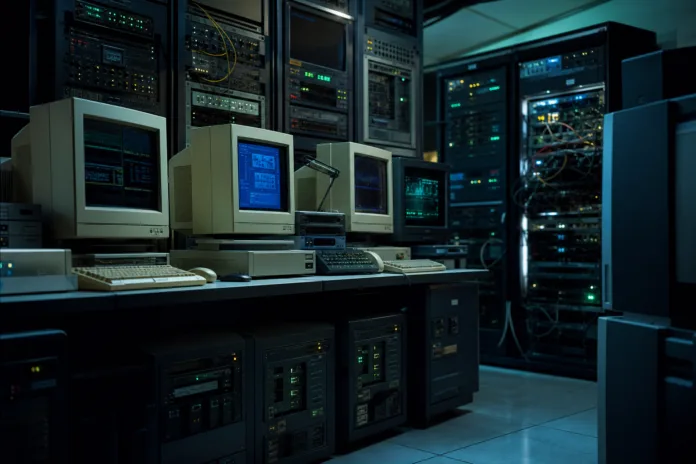
At the heart of the control room were two distinct workstations belonging to engineers Dennis Nedry and Ray Arnold. Their setup wasn’t just chaos, it was a multi-vendor, heterogeneous architecture nightmare.
Dennis Nedry’s Desk (The Mess)
- Main Workstation: An SGI IRIS Crimson, a beast of a machine powered by a 100 MHz R4000 or 150 MHz R4400 MIPS processor, capable of fitting up to 256 MB of RAM. It was too big for the desk and sat on the floor.
- Secondary Machines: Two Macintosh Quadra 700, running Motorola 68040 @ 25 MHz. A stark contrast in architecture.
- Peripherals: A stack of five PLI Mini Array hard drives, a Motorola Envoy PDA, and a jumble of monitors and storage devices.
Ray Arnold’s Desk (The "Clean" One)
- Workstation: An SGI R4000 Indigo.
- Secondary Machine: A single Macintosh Quadra 700.
- Peripherals: A smaller stack of two PLI Mini Arrays and a CCTV screen.
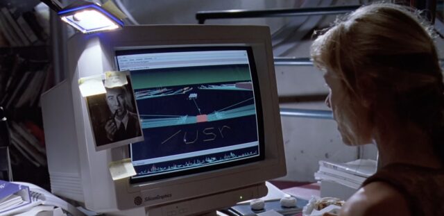
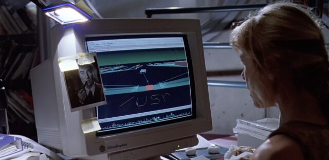
fsn 3D file browser — a UI that prioritized visual novelty over clarity.The Supercomputer: The Thinking Machines CM-5
In the background, the supercomputer of choice wasn’t the Cray from the book. Cray brushed off the production, so they turned to Thinking Machines, who were happy to provide their CM-5. A former employee noted on Hacker News that the biggest audience reaction during a special screening was for the CM-5 and the iconic Unix line. The CM-5’s blinking LED panels were famously random, pure eye candy, a design choice that feels both delightfully cyberpunk and terrifyingly cosmetic for a life-safety system.
The User Interface: Where "Snazzy" Meets "Critically Flawed"
The UI in Jurassic Park is deceiving. It looks futuristic and powerful, but it’s a masterclass in how not to design a system for a high-stakes environment. Every interface choice screams "form over function" in a context where function is a matter of life and death.
FSN: The 3D File Browser That Launched a Thousand Memes
The most infamous UI element is the fsn file explorer. It’s a real, shipping product from SGI, a 3D File System Navigator for IRIX. To modern eyes, it’s a gimmick. But to a 1993 audience, it was the future.
The core UX failure here is fundamental: it prioritized visual novelty over clarity and efficiency. Can you imagine a network engineer trying to debug a system outage by flying through a 3D city of files? It’s impossible. The fsn interface is beautiful for a demo, but utterly useless for the urgent, targeted actions required to save a system under attack.
The "Hacker" Aesthetic: Source Code on Screen
When we see Nedry’s system after the lockdown, we’re greeted with actual Pascal source code from the Macintosh Programmer’s Workshop (MPW). This was a real coding environment, which is a great detail. But from a design perspective, it’s a terrible primary interface for a park-wide control system.
The message is clear: This park is held together by a single, overworked, and bitter developer who left the system in a state of total transparency. There is no abstraction. The user is looking at the raw guts of the system. This is the opposite of good design. It suggests the system was built as a prototype, never intended for operational use by anyone other than its creator.
The Magic Words: "whte_rbt.obj"
Ray Arnold’s explanation of the lockdown is a fascinating glimpse into a security design failure. "White rabbit object. Whatever it did, it did it all. But with the key-checks off, the computer didn’t file the keystrokes." This is a perfect description of a classic security flaw: the system’s failure state is to grant all access. The "White Rabbit" object (whte_rbt.obj from the novel by Michael Crichton, himself a programmer) acts like a sudo command with the password set to the magic word. Once triggered, all access controls evaporate. It’s a backdoor, plain and simple.
The System Architecture: A Single Point of Catastrophe
The system design is a blueprint for disaster. Every modern architect looking at this should be breaking out in a cold sweat.
- Total Centralization: Everything, security, power, animal tracking, the "Nedryland" system, is run from this one room, by a handful of workstations. There is no redundancy. There is no failover.
- The "Wizard" Problem: Dennis Nedry is the sole architect, developer, and operator of the entire system. He even named it "Nedryland." When he goes rogue, there is no one else who can untangle the mess. The system’s entire security posture relies on his goodwill.
- Networked, Unsecured Backdoors: The entire lockdown is a network-driven event. A single malicious object ("whte_rbt.obj") broadcast across the network brings the whole park to its knees. There are no network segmentation, no firewalls, no "least privilege" principles.
- Lack of Monitoring and Alerting: The system fails without proper user-feedback. Arnold and Sattler don’t know what happened until they try to use the system. The UI doesn’t display a status of "critical failure", it just stops working.
What We Can Learn from Isla Nublar’s IT Department
The lessons from Jurassic Park are timeless. They’re not about ’90s hardware, they’re about the eternal truths of building systems that matter.
- Communicate Architectural Decisions: You can’t build a "Nedryland." A system built by a single mind is a house of cards. You need to be able to communicate complex architectural decisions to non-technical stakeholders, not just implement them.
- Design for the Failure You Can’t Imagine: The system had a clear, devastating failure mode. What’s the "whte_rbt.obj" in your architecture? Is it an unsecured API key? A hidden endpoint? An overload condition that bypasses your auth middleware?
- Speed Kills (Reliability): The 3D FSN was fast. The QuickTime "video call" looked cool. But they made the system slower to use under duress. In high-stakes environments, clarity trumps novelty. Every extra second it takes a user to parse the interface is a second the system is vulnerable.
- Your Greenfield Project Isn’t Safe: Every architect thinks they’re building a robust system. But a lack of discipline and external review can turn even the most promising project into a technical debt bomb. As we see with many greenfield projects, the reality vs. idealized system design is a chasm you must actively bridge.
- The Human is the Weakest Link: The system was technically sound, until Nedry turned on the park. You can’t solve for malicious insiders or deep negligence with technology alone. You need process, checks-and-balances, and a system designed so that a single human cannot cause a total, unrecoverable failure.
The Real Legacy of Jurassic Park’s Systems
For all its flaws, the control room of Jurassic Park is a work of art. It feels real. The blinking lights, the real-time synchronization of CRT monitors with film cameras (a job whose entire purpose was to make the screens look real on film), the detailed product placement, it all works.
It works because it captures the feeling of a complex, bespoke system. It’s not a glazed-over magic tablet. It’s expensive, complicated, filled with cables from multiple vendors, and ultimately, fragile.
This is the most important lesson for modern architects. The most "real" systems are the ones you can see failing. The best UI is the one that helps you prevent that failure. Jurassic Park’s computers were a product of their time, but its design philosophy, prioritizing the demo over the disaster, the single developer over the team, and the snazzy UI over the actionable one, is a timeless warning.
In an age of AI copilots and hyper-scaled cloud infrastructure, it’s easier than ever to build systems that look great but fail catastrophically. The next time you’re signing off on a design review, ask yourself: Is this a system that would survive Dennis Nedry? If the answer is no, you might want to rethink your architecture.
After all, your users might not encounter a velociraptor, but they will encounter a production outage. And a snazzy UI won’t save you from that.