The Arrow Direction War Is Silently Destroying Your Architecture
This isn’t a bad joke. It’s a daily reality in software development, and it’s costing you more than you think. The debate over which way an arrow should point, toward the caller or away from it, following control flow or data flow, represents a fundamental breakdown in how we communicate system design. When distributed teams can’t agree on basic visual semantics, they build divergent mental models that eventually harden into confusion when architecture diagrams don’t reveal underlying distinctions.
The Semantics Crisis Hiding in Plain Sight
The conflict usually surfaces during design reviews with deceptively simple questions: Does the arrow point from the microservice to the database, or the database to the microservice? When Service A calls Service B, does the arrow originate from A (showing initiation) or from B (showing data return)?
Developers on architecture forums frequently debate these conventions, with camps split between “dependency direction” purists and “data flow” realists. One faction argues arrows should trace control flow, from the caller initiating the action toward the receiver. The other insists arrows should represent data movement, pointing from the API toward the consumer receiving the payload. Both positions are defensible. Both are used in production at major organizations. And both are mutually incomprehensible to each other without explicit legend.
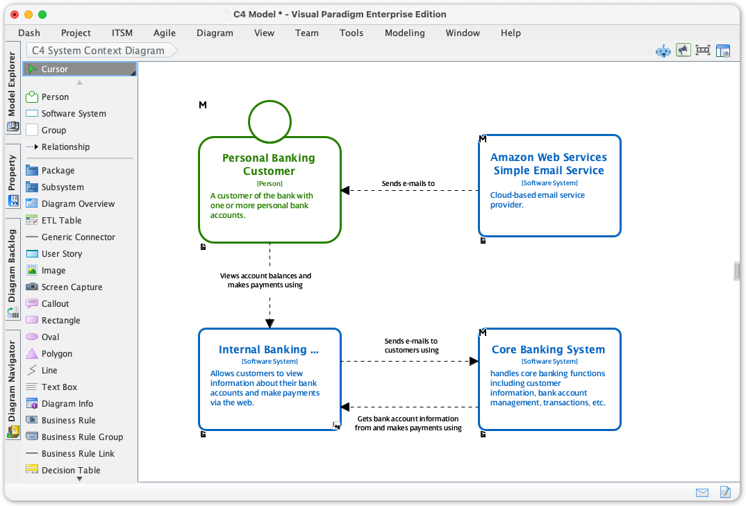
Simon Brown, creator of the C4 Model, has dedicated entire workshop sections to this ambiguity. His recommendation cuts through the noise: arrows should be unidirectional and typically represent dependencies flowing from the initiator to the receiver. This aligns with how we conceptualize inter-module communication where architectural illusions shatter, the caller knows about the callee, not vice versa.
But here’s the uncomfortable truth: most teams don’t follow this convention consistently because they don’t realize they’re mixing metaphors.
When Dependency Meets Data Flow
The root problem is that architecture diagrams attempt to compress multiple dimensions into two-dimensional space. We’re trying to simultaneously show:
- Control flow: Who initiates the conversation
- Data flow: Where information actually moves
- Dependencies: Which components know about others
- Temporal sequence: What happens before what
Attempting to represent all four in a single static diagram creates the architectural equivalent of a linguistic false friend, symbols that look similar but carry different meanings depending on the viewer’s background.
The C4 Model attempts to solve this through hierarchical abstraction, forcing teams to separate concerns across four distinct zoom levels: System Context, Containers, Components, and Code. At the Context level, you’re mapping actors and external systems. At the Container level, you’re showing deployable units and their interactions. Each level has its own semantic rules.
Yet even within the C4 framework, teams stumble over how modules actually communicate across boundary definitions. The model provides the scaffolding, but it doesn’t automatically align your team’s visual vocabulary. Without explicit agreement on whether an arrow represents “sends HTTP request to” versus “depends on”, you end up with diagrams that are technically correct according to the notation but semantically ambiguous to the reader.
The Cost of Ambiguous Abstraction
This isn’t academic nitpicking. When a senior engineer draws an arrow pointing from the API Gateway to the Auth Service, but the junior developer interprets that arrow as data flowing back to the gateway, you get misaligned implementations. The junior builds a synchronous blocking call where an async event was intended. The system experiences cascading failures under load that were “obviously” going to happen to anyone who understood the diagram “correctly.”
The situation worsens in distributed organizations where overloaded terminology and clarifying architectural boundaries compound the confusion. A “service” in one diagram might be a container in another and a component in a third. Without consistent visual semantics, architectural drift becomes inevitable, the code slowly diverges from the diagrams until the documentation becomes actively misleading.
French software architect Martin Moraz notes that this drift represents a strategic liability, particularly in regulated industries where outdated architecture diagrams complicate security audits and cloud migrations. When your diagrams show data flowing east but your observability tools show it flowing west, you’ve created a cognitive gap that slows incident response and obscures bottleneck identification.
Toward Living Documentation
The solution isn’t to pick a winner in the arrow direction war, it’s to make the semantics explicit and executable. Architecture as Code approaches using tools like PlantUML, Structurizr, or Mermaid force teams to define their relationships unambiguously. When you write ComponentA -> ComponentB : "HTTPS/JSON", the direction is explicit, version-controlled, and reviewable.
Modern AI-assisted diagramming tools can help standardize C4 representations, but they also risk amplifying existing ambiguities if the underlying prompts don’t specify semantic intent. The key is treating diagrams as code, subject to linting, peer review, and CI/CD validation, rather than as static artifacts produced once and forgotten.
Even better, combine static diagrams with runtime observability. Tools that extract actual dependency graphs from distributed tracing data can generate C4 diagrams that reflect production reality rather than aspirational architecture. This closes the feedback loop between confusion when architecture diagrams don’t reveal underlying distinctions and the actual system behavior.
Practical Rules for Visual Clarity
If you’re not ready to automate your architecture documentation (though you should be), enforce these conventions manually:
1. One metaphor per diagram. Don’t mix dependency arrows and data flow arrows on the same canvas. If you’re showing control flow, label it explicitly. If you’re showing data movement, use a different color or line style.
2. Always include a legend. Every diagram should define what an arrow means in that specific context. “Arrow direction indicates dependency (points toward dependency)” eliminates ambiguity.
3. Default to dependency direction. Following the C4 Model’s convention, arrows typically flow from the initiator toward the receiver. This aligns with how we think about inter-module communication where architectural illusions shatter, the dependent points to the dependency.
4. Use supplementary views. When you need to show runtime behavior, create a Dynamic diagram or Sequence diagram rather than overloading your static Container diagram with temporal information.
5. Review for semantic consistency. During architecture reviews, explicitly ask: “Does everyone interpret these arrows the same way?” The uncomfortable silence that follows usually reveals misalignment worth fixing before it hits production.
The arrow direction war won’t end with a universal standard, different contexts genuinely require different representations. But it can end with explicit communication about which convention you’re using and why. In distributed systems, the cost of ambiguity compounds with every new microservice. Clear visual semantics aren’t just documentation hygiene, they’re load-bearing infrastructure for team cognition.